2 Clustering
As we mentioned in the introduction, a core idea of data science is that things that look the same (in that, when described with data, they resemble one another) are likely to be the same. Although this sounds like a simplifying assumption, this can provide the basis for approaches in which we create groups in data that have no labels. This task is called clustering: we seek to add a label to each observation, in order to form groups, and the data we work from do not have a label that we can use to train a model. In this chapter, we will explore the k-means algorithm for clustering, and illustrate how it can be used in practice.
2.1 A digression: which birds are red?
Before diving in, it is a good idea to ponder a simple case. We can divide everything in just two categories: things with red feathers, and things without red feathers. An example of a thing with red feathers is the Northern Cardinal (Cardinalis cardinalis), and things without red feathers are the iMac G3, Haydn’s string quartets, and of course the Northern Cardinal (Cardinalis cardinalis).
See, biodiversity data science is complicated, because it tends to rely on the assumption that we can categorize the natural world, and the natural world (mostly in response to natural selection) comes up with ways to be, well, diverse and hard to categorize. In the Northern Cardinal, this is shown in males having red feathers, and females having mostly brown feathers. Before moving forward, we need to consider ways to solve this issue, as this issue will come up all the time.
The first mistake we have made is that the scope of objects we want to classify, which we will describe as the “domain” of our classification, is much too broad: there are few legitimate applications where we will have a dataset with Northern Cardinals, iMac G3s, and Haydn’s string quartets. Picking a reasonable universe of classes would have solved our problem a little. For example, among the things that do not have red feathers are the Mourning Dove, the Kentucky Warbler, and the House Sparrow.
The second mistake that we have made is improperly defining our classes; bird species exhibit sexual dimorphism (not in an interesting way, like wrasses, but let’s give them some credit for trying). Assuming that there is such a thing as a Northern Cardinal is not necessarily a reasonable assumption! And yet, the assumption that a single label is a valid representation of non-monomorphic populations is a surprisingly common one, with actual consequences for the performance of image classification algorithms (Luccioni and Rolnick 2023). This assumption reveals a lot about our biases: male specimens are over-represented in museum collections, for example (Cooper et al. 2019). In a lot of species, we would need to split the taxonomic unit into multiple groups in order to adequately describe them.
The third mistake we have made is using predictors that are too vague. The “presence of red feathers” is not a predictor that can easily discriminate between the Northen Cardinal (yes for males, sometimes for females), the House Finch (a little for males, no for females), and the Red-Winged Black Bird (a little for males, no for females). In fact, it cannot really capture the difference between red feathers for the male House Finch (head and breast) and the male Red Winged Black Bird (wings, as the name suggests).
The final mistake we have made is in assuming that “red” is relevant as a predictor. In a wonderful paper, Cooney et al. (2022) have converted the color of birds into a bird-relevant colorimetric space, revealing a clear latitudinal trend in the ways bird colors, as perceived by other birds, are distributed. This analysis, incidentally, splits all species into males and females. The use of a color space that accounts for the way colors are perceived is a fantastic example of why data science puts domain knowledge front and center.
Deciding which variables are going to be accounted for, how the labels will be defined, and what is considered to be within or outside the scope of the classification problem is difficult. It requires domain knowledge (you must know a few things about birds in order to establish criteria to classify birds), and knowledge of how the classification methods operate (in order to have just the right amount of overlap between features in order to provide meaningful estimates of distance).
2.2 The problem: classifying pixels from an image
Throughout this chapter, we will work on a single image – we may initially balk at the idea that an image is data, but it is! Specifically, an image is a series of instances (the pixels), each described by their position in a multidimensional colorimetric space. Greyscale images have one dimension, and images in color will have three: their red, green, and blue channels. Not only are images data, this specific dataset is going to be far larger than many of the datasets we will work on in practice: the number of pixels we work with is given by the product of the width, height, and depth of the image!
In fact, we are going to use an image with many dimensions: the data in this chapter are coming from a Landsat 9 scene (Vermote et al. 2016), for which we have access to 9 different bands.
| Band | Measure | Notes |
|---|---|---|
| 1 | Aerosol | Good proxy for Chl. in oceans |
| 2 | Visible blue | |
| 3 | Visible green | |
| 4 | Visible red | |
| 5 | Near-infrared (NIR) | Reflected by healthy plants |
| 6, 7 | Short wavelength IR (SWIR 1) | Good at differentiating wet earth and dry earth |
| 8 | Panchromatic | High-resolution monochrome |
| 9 | Cirrus band | Can pick up high and thin clouds |
| 10, 11 | Thermal infrared |
By using the data present in the channels, we can reconstruct an approximation of what the landscape looked like (by using the red, green, and blue channels).
Or can we?
If we were to invent a time machine, and go stand directly under Landsat 9 at the exact center of this scene, and look around, what would we see? We would see colors, and they would admit a representation as a three-dimensional vector of red, green, and blue. But we would see so much more than that! And even if we were to stand within a pixel, we would see a lot of colors. And texture. And depth. We would see something entirely different from this map; and we would be able to draw a lot more inferences about our surroundings than what is possible by knowing the average color of a 30x30 meters pixel. But just like we can get more information that Landsat 9, so too can Landsat 9 out-sense us when it comes to getting information. In the same way that we can extract a natural color composite out of the different channels, we can extract a fake color one to highlight differences in the landscape.
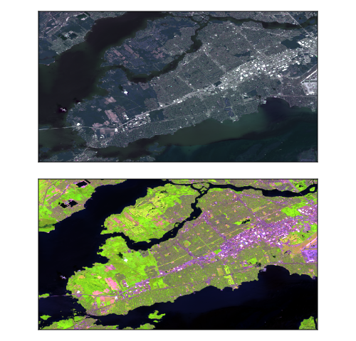
In Figure 2.1, we compare the natural color reconstruction (top) to a false color composite. All of the panels in Figure 2.1 represent the same physical place at the same moment in time; but through them, we are looking at this place with very different purposes. This is not an idle observation, but a core notion in data science: what we measure defines what we can see. In order to tell something ecologically meaningful about this place, we need to look at it in the “right” way. Of course, although remote sensing offers a promising way to collect data for biodiversity monitoring at scale (Gonzalez et al. 2023), there is no guarantee that it will be the right approach for all problems. More (fancier) data is not necessarily right for all problems.
We will revisit the issue of variable selection and feature engineering in ?sec-variable-selection.
So far, we have looked at this area by combining the raw data. Depending on the question we have in mind, they may not be the right data. In fact, they may not hold information that is relevant to our question at all; or worse, they can hold more noise than signal. The area we will work on in this chapter is a very small crop of a Landsat 9 scene, taken on path 14 and row 28, early in late June 2023. It shows the western tip of the island of Montréal, as well as Lake Saint-Louis to the south (not actually a lake), Lake Deux-Montages to the north (not actually a lake either), and a small part of Oka national park. This is an interesting area because it has a high variety of environments: large bodies of water, forested areas (bright green in the composite), densely urbanized places (bright purple and white in the composite), less densely urbanized (green-brown), and cropland to the western tip of the island.
But can we classify these different environments starting in an ecologically relevant way? Based on our knowledge of plants, we can start thinking about this question in a different way. Specifically, “can we guess that a pixel contains plants?”, and “can we guess at how much water there is in a pixel?”. Thankfully, ecologists, whose hobbies include (i) guesswork and (ii) plants, have ways to answer these questions rather accurately.
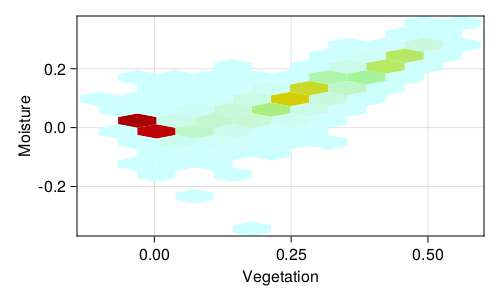
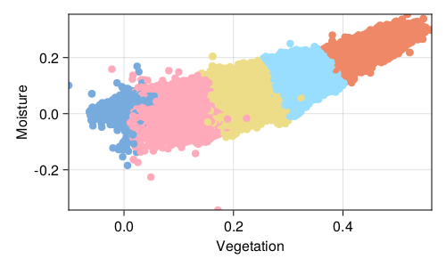
One way to do this is to calculate the normalized difference vegetation index, or NDVI (Kennedy and Burbach 2020). NDVI is derived from the band data (NIR - Red), and there is an adequate heuristic using it to make a difference between vegetation, barren soil, and water. Because plants are immediately tied to water, we can also consider the NDWI (water; Green - NIR) and NDMI (moisture; NIR - SWIR1) dimensions: taken together, these information will represent every pixel in a three-dimensional space, telling us whether there are plants (NDVI), whether they are stressed (NDMI), and whether this pixel is a water body (NDWI). Other commonly used indices based on Landsat 9 data include the NBR (Normalized Burned Ratio), for which high values are suggestive of a history of intense fire (Roy, Boschetti, and Trigg 2006 have challenged the idea that this measure is relevant immediately post-fire), and the NDBI (Normalized Difference Built-up Index) for urban areas.
We can look at the relationship between the NDVI and NDMI data Figure 2.2. For example, NDMI values around -0.1 are low-canopy cover with low water stress; NDVI values from 0.2 to 0.5 are good candidates for moderately dense crops. Notice that there is a strong (linear) relationship between NDVI and NDMI. Indeed, none of these indices are really independent; this implies that they are likely to be more informative taken together than when looking at them one at a time (Zheng et al. 2021). Indeed, urban area tend to have high values of the NDWI, which makes the specific task of looking for swimming pools (for mosquito control) more challenging than it sounds (McFeeters 2013).
By picking these four transformed values, instead of simply looking at the clustering of all the bands in the raw data, we are starting to refine what the algorithm sees, through the lens of what we know is important about the system. With these data in hands, we can start building a classification algorithm.
2.3 The theory behind k-means clustering
In order to understand the theory underlying k-means, we will work backwards from its output. As a method for clustering, k-means will return a vector of class memberships, which is to say, a list that maps each observation (pixel, in our case) to a class (tentatively, a cohesive landscape unit). What this means is that k-means is a transformation, taking as its input a vector with three dimensions (NDVI, NDMI, NDWI), and returning a scalar (an integer, even!), giving the class to which this pixel belongs. Pixels only belongs to one class. These are the input and output of our blackbox, and now we can start figuring out its internals.
2.3.1 Inputs and parameters
Throughout this book, we will use \(\mathbf{X}\) to note the matrix of features, and \(\mathbf{y}\) to note the vector of labels. Instances are columns of the features matrix, noted \(\mathbf{x}_i\).
In k-means, a set of observations \(\mathbf{x}_i\) are assigned to a set of classes \(\mathbf{C}\), also called the clusters. All \(\mathbf{x}_i\) are vectors with the same dimension (we will call it \(f\), for features), and we can think of our observations as a matrix of features \(\mathbf{X}\) of size \((f, n)\), with \(f\) features and \(n\) observations (the columns of this matrix).
The number of classes of \(\mathbf{C}\) is \(|\mathbf{C}| = k\), and \(k\) is an hyper-parameter of the model, as it needs to fixed before we start running the algorithm. Each class is defined by its centroid, a vector \(\mathbf{c}\) with \(f\) dimensions (i.e. the centroid corresponds to a potential “idealized” observation of this class in the space of the features), which k-means progressively refines.
2.3.2 Assigning instances to classes
Of course, the correct distance measure to use depends on what is appropriate for the data!
Instances are assigned to the class for which the distance between themselves and the centroid of this class is lower than the distance between themselves and the centroid of any other class. To phrase it differently, the class membership of an instance \(\mathbf{x}_i\) is given by
\[ \text{argmin}_j \left\|\mathbf{x}_i-\mathbf{c}_j\right\|_2 \,, \tag{2.1}\]
which is the value of \(j\) that minimizes the \(L^2\) norm (\(\|\cdot\|_2\), the Euclidean distance) between the instance and the centroid; \(\text{argmin}_j\) is the function returning the value of \(j\) that minimizes its argument. For example, \(\text{argmin}(0.2,0.8,0.0)\) is \(3\), as the third argument is the smallest. There exists an \(\text{argmax}\) function, which works in the same way.
2.3.3 Optimizing the centroids
Of course, what we really care about is the assignment of all instances to the classes. For this reason, the configuration (the disposition of the centroids) that solves our specific problem is the one that leads to the lowest possible variance within the clusters. As it turns out, it is not that difficult to go from Equation 2.1 to a solution for the entire problem: we simply have to sum over all points!
This leads to a measure of the variance, which we want to minimize, expressed as
\[ \sum_{i=1}^k \sum_{\mathbf{x}\in \mathbf{C}_i} \|\mathbf{x} - \mathbf{c}_i\|_2 \,. \tag{2.2}\]
The part that is non-trivial is now to decide on the value of \(\mathbf{c}\) for each class. This is the heart of the k-means algorithm. From Equation 2.1, we have a criteria to decide to which class each instance belongs. Of course, there is nothing that prevents us from using this in the opposite direction, to define the instance by the points that form it! In this approach, the membership of class \(\mathbf{C}_j\) is the list of points that satisfy the condition in Equation 2.1. But there is no guarantee that the current position of \(\mathbf{c}_j\) in the middle of all of these points is optimal, i.e. that it minimizes the within-class variance.
This is easily achieved, however. To ensure that this is the case, we can re-define the value of \(\mathbf{c}_j\) as
\[ \mathbf{c}_j = \frac{1}{|\mathbf{C}_j|}\sum\mathbf{C}_j \,, \tag{2.3}\]
where \(|\cdot|\) is the cardinality of (number of istances in) \(\mathbf{C}_j\), and \(\sum \mathbf{C}_j\) is the sum of each feature in \(\mathbf{C}_j\). To put it plainly: we update the centroid of \(\mathbf{C}_j\) so that it takes, for each feature, the average value of all the instances that form \(\mathbf{C}_j\).
2.3.4 Updating the classes
Repeating a step multiple times in a row is called an iterative process, and we will see a lot of them.
Once we have applied Equation 2.3 to all classes, there is a good chance that we have moved the centroids in a way that moved them away from some of the points, and closer to others: the membership of the instances has likely changed. Therefore, we need to re-start the process again, in an iterative way.
But until when?
Finding the optimal solution for a set of points is an NP-hard problem (Aloise et al. 2009), which means that we will need to rely on a little bit of luck, or a whole lot of time. The simplest way to deal with iterative processes is to let them run for a long time, as after a little while they should converge onto an optimum (here, a set of centroids for which the variance is as good as it gets), and hope that this optimum is global and not local.
A global optimum is easy to define: it is the state of the solution that gives the best possible result. For this specific problem, a global optimum means that there are no other combinations of centroids that give a lower variance. A local optimum is a little bit more subtle: it means that we have found a combination of centroids that we cannot improve without first making the variance worse. Because the algorithm as we have introduced it in the previous sections is greedy, in that it makes the moves that give the best short-term improvement, it will not provide a solution that temporarily makes the variance higher, and therefore is susceptible to being trapped in a local optimum.
In order to get the best possible solution, it is therefore common to run k-means multiple times for a given \(k\), and to pick the positions of the centroids that give the best overall fit.
2.3.5 Identification of the optimal number of clusters
One question that is left un-answered is the value of \(k\). How do we decide on the number of clusters?
There are two solutions here. One is to have an a priori knowledge of the number of classes. For example, if the purpose of clustering is to create groups for some specific task, there might be an upper/lower bound to the number of tasks you are willing to consider. The other solution is to run the algorithm in a way that optimizes the number of clusters for us.
This second solution turns out to be rather simple with k-means. We need to change the value of \(k\), run it on the same dataset several times, and then pick the solution that was optimal. But this is not trivial. Simply using Equation 2.2 would lead to always preferring many clusters. After all, each point in its own cluster would get a pretty low variance!
For this reason, we use measures of optimality that are a little more refined. One of them is the Davies and Bouldin (1979) method, which is built around a simple idea: an assignment of instances to clusters is good if the instances within a cluster are not too far away from the centroids, and the centroids are as far away from one another as possible.
The Davies-Bouldin measure is striking in its simplicity. From a series of points and their assigned clusters, we only need to compute two things. The first is a vector \(\mathbf{s}\), which holds the average distance between the points and their centroids (this is the \(\left\|\mathbf{x}_i-\mathbf{c}_j\right\|_2\) term in Equation 2.1, so this measure still relates directly to the variance); the second is a matrix \(\mathbf{M}\), which measures the distances between the centroids.
These two information are combined in a matrix \(\mathbf{R}\), wherein \(\mathbf{R}_{ij} = (s_i + s_j)/\mathbf{M}_{ij}\). The interpretation of this term is quite simply: is the average distance within clusters \(i\) and \(j\) much larger compared to the distance between these clusters. This is, in a sense, a measure of the stress that these two clusters impose on the entire system. In order to turn this matrix into a single value, we calculate the maximum value (ignoring the diagonal!) for each row: this is a measure of the maximal amount of stress in which a cluster is involved. By averaging these values across all clusters, we have a measure of the quality of the assignment, that can be compared for multiple values of \(k\).
Note that this approach protects us against the each-point-in-its-cluster situation: in this scenario, the distance between clusters would decrease really rapidly, meaning that the values in \(\mathbf{R}\) would increase; the Davies-Bouldin measure indicates a better clustering when the values are lower.
In fact, there is very little enumeration of techniques in this book. The important point is to understand how all of the pieces fit together, not to make a census of all possible pieces.
There are alternatives to this method, including silhouettes (Rousseeuw 1987) and the technique of Dunn (1974). The question of optimizing the number of clusters goes back several decades (Thorndike 1953), and it still actively studied. What matter is less to give a comprehensive overview of all the measures: the message here is to pick one that works (and can be justified) for your specific problem!
2.4 Application: optimal clustering of the satellite image data
2.4.1 Initial run
Before we do anything else, we need to run our algorithm with a random pick of hyper-parameters, in order to get a sense of how hard the task ahead is. In this case, using \(k = 3\), we get the results presented in Figure 2.3.
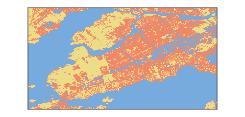
After iterating the k-means algorithm, we obtain a classification for every pixel in the landscape. This classification is based on the values of NDVI, NDMI, and NDWI indices, and therefore groups pixels based on specific assumptions about vegetation and stress. This clustering was produced using \(k=3\), i.e. we want to see what the landscape would look like when divided into three categories.
In fact, take some time to think about how you would use \(k\)-means to come up with a way to remove pixels with only water from this image!
It is always a good idea to look at the first results and state the obvious. Here, for example, we can say that water is easy to identify. In fact, removing open water pixels from images is an interesting image analysis challenge (Mondejar and Tongco 2019), and because we used an index that specifically identifies water bodies (NDWI), it is not surprising that there is an entire cluster that seems to be associated with water. But if we take a better look, it appears that there groups of pixels that represent dense urban areas that are classified with the water pixels. When looking at the landscape in a space with three dimensions, it looks like separating densely built-up environment and water is difficult.
This might seem like an idle observation, but this is not the case! It means that when working on vegetation-related questions, we will likely need at least one cluster for water, and one cluster for built-up areas. This is helpful information, because we can already think about how many classes of vegetation we are willing to accept, and add (at least) two clusters to capture other types of cover.
2.4.2 Optimal number of pixels
We will revisit the issue of tuning the hyper-parameters in more depth in Chapter 7.
In order to produce Figure 2.3, we had to guess at a number of classes we wanted to split the landscape into. This introduces two important steps in coming up with a model: starting with initial parameters in order to iterate rapidly, and then refining these parameters to deliver a model that is fit for purpose. Our discussion in Section 2.4.1, where we concluded that we needed to keep (maybe) two classes for water and built-up is not really satisfying, as we do not yet have a benchmark to evaluate the correct value of \(k\); we know that it is more than 3, but how much more?
We will now change the values of \(k\) and use the Davies and Bouldin (1979) measure introduced in Section 2.3.5 to identify the optimal value of \(k\). The results are presented in Figure 2.4. Note that we only explore \(k \in [3, 10]\). More than 8 categories is probably not very actionable, and therefore we can make the decision to only look at this range of parameters. Sometimes (always!) the best solution is the one that gets your job done.
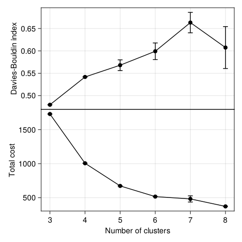
There are two interesting things in Figure 2.4. First, note that for \(k=\{3,4\}\), there is almost no dispersal: all of the assignments have the exact same score, which is unlikely to happen except if the assignments are the same every time! This is a good sign, and, anecdotally, something that might suggest a really information separation of the points. Second, \(k = 3\) has by far the lowest Davies-Bouldin index of all values we tried, and is therefore strongly suggestive of an optimal hyper-parameter. But in Figure 2.3, we already established that one of these clusters was capturing both water and built-up environments, so although it may look better from a quantitative point of view, it is not an ideal solution for the specific problem we have.
In this specific case, it makers very little sense not to use \(k = 4\) or \(k = 5\). They have about the same performance, but this gives us potentially more classes that are neither water nor built-up. This image is one of many cases where it is acceptable to sacrifice a little bit of optimality in order to present more actionable information. Based on the results in this section, we will pick the largest possible \(k\) that does not lead to a drop in performance, which in our case is \(k=5\).
2.4.3 Clustering with optimal number of classes
The clustering of pixels using \(k = 5\) is presented in Figure 2.5. Unsurprisingly, k-means separated the open water pixels, the dense urban areas, as well as the more forested/green areas. Now is a good idea to start thinking about what is representative of these clusters: one is associated with very high NDWI value (these are the water pixels), and two classes have both high NDVI and high NDMI (suggesting different categories of vegetation).
┌ Warning: The clustering cost increased at iteration #37
└ @ Clustering ~/.julia/packages/Clustering/wNDPu/src/kmeans.jl:191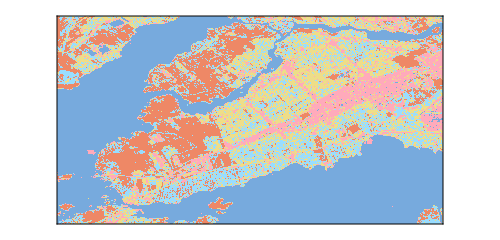
We will revisit the issue of understanding how a model makes a prediction in Chapter 8.
The relative size of the clusters (as well as the position of their centroids) is presented in Table 2.1. There is a good difference in the size of the clusters, which is an important thing to note. Indeed, a common myth about k-means is that it gives clusters of the same size. This “size” does not refer to the cardinality of the clusters, but to the volume that they cover in the space of the parameters. If an area of the space of parameters is more densely packed with instances, the cluster covering the area will have more points!
| Cluster | Cover | NDVI | NDWI | NDMI |
|---|---|---|---|---|
| 1 | 38 | -0.018 | 0.012 | 0.006 |
| 4 | 10 | 0.096 | -0.152 | 0.005 |
| 3 | 19 | 0.224 | -0.262 | 0.08 |
| 5 | 17 | 0.32 | -0.343 | 0.139 |
| 2 | 16 | 0.439 | -0.443 | 0.223 |
In fact, this behavior makes k-means excellent at creating color palettes from images! Cases in point, Karthik Ram’s Wes Anderson palettes, and David Lawrence Miller’s Beyoncé palettes. Let it never again be said that ecologists should not be trusted with machine learning methods.
The area of the space of parameters covered by each cluster in represented in Figure 2.6, and this result is actually not surprising, if we spend some time thinking about how k-means work. Because our criteria to assign a point to a cluster is based on the being closest to its centroid than to any other centroid, we are essentially creating Voronoi cells, with linear boundaries between them.
By opposition to a model based on, for example, mixtures of Gaussians, the assignment of a point to a cluster in k-means is independent of the current composition of the cluster (modulo the fact that the current composition of the cluster is used to update the centroids). In fact, this makes k-means closer to (or at least most efficient as) a method for quantization (Gray 1984).
2.5 Conclusion
In this chapter, we have used the k-means algorithm to create groups in a large dataset that had no labels, i.e. the points were not assigned to a class. By picking the features we wanted to cluster the point, we were able to highlight specific aspects of the landscape. In Chapter 3, we will start adding labels to our data, and shift our attention from classification to regression problems.